
Grant Fletcher, Senior Health and Science Editor.
There is a particular kind of drawer most women in New Zealand own: eight or nine eyeshadow palettes, half of them barely touched, each bought because a swatch on someone else’s arm looked promising under shop lighting. At home, in ordinary daylight, the colours go muddy or the shimmer sheds down the cheek before ten in the morning. The question that actually matters is not which palette is trending. It is what makes a pressed powder perform once it leaves the counter.
Here is the fact worth knowing before anything else: pigment load, not packaging or price, is the single biggest predictor of how a shadow will wear. A palette can be beautifully designed and still be mostly filler. This guide walks through what to check with your own eyes and fingertips, so you can judge a palette before you pay for it, not after.
- Pigment payoff, not price, predicts performance: a swatch test on the back of the hand tells you more in ten seconds than any marketing claim on the box.
- Undertone matching happens in daylight, never under shop lighting: warm, cool and neutral shadows read completely differently under fluorescent bulbs.
- Fallout is a formula fault, not bad luck: it comes down to how the pigment is bonded, and you can spot the risk before you buy.
Finding Your Undertone In Daylight
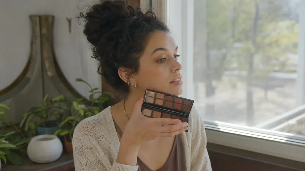
Shop lighting is almost always fluorescent or heavily warmed to flatter skin, which is exactly why a shadow that looked golden and lovely at the counter can look flat and yellow-green at your desk by mid-morning.
The fix is simple: take the palette, or a sample swatch, to a window or outside for thirty seconds before buying. Daylight is the closest thing to a neutral reference most of us have without a lab.
Undertone is really about contrast, not colour category. A cool-toned skin will make a warm copper shadow look slightly dull, the way a terracotta pot looks different against grey concrete than against warm brick. Neither is wrong, but the effect changes.
A common mistake is assuming undertone is fixed by skin colour alone. It is not. Two people with similar depth of skin can have opposite undertones, and a palette marketed as universal is a marketing claim, not a guarantee. Test it on your own jawline, not the back of a display card.
Reading Pigment Payoff Before You Buy
Pigment payoff is the proportion of colour that transfers from the pan to your skin in one swipe, without heavy patting or wetting the brush. It is the single most useful thing you can test in a shop.
Run one finger across the shadow once, lightly, and look at what lands. A well-milled, well-loaded shadow leaves a visible, even colour on the first pass. A weak one leaves a faint smear that needs three or four swipes to build.
The household comparison is instant coffee against a poorly stocked jar: some brands pack the granules densely, so one spoon does the job, while others are mostly filler, so you need three spoons to get the same strength. Fillers such as talc or mica base are not inherently bad. They give a shadow slip and texture. But too much filler relative to pigment is what makes a shadow disappointing on the eye.
A 2019 study in the International Journal of Cosmetic Science measured pigment concentration across a range of pressed eyeshadow formulas and found payoff varied by more than threefold between products marketed at similar depth of colour, with no reliable link to shelf price. In other words, testing with your own finger beats trusting the price tag.
What Blendability Actually Means
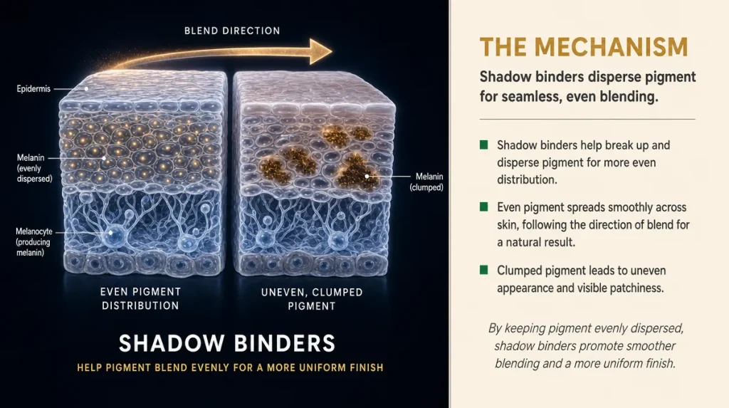
Blendability describes how easily a shadow’s edges soften into another colour without dragging or patching. It comes down to the binder, the wax or oil that holds pigment particles together in the pan.
Think of two versions of butter: one fresh from the fridge, one left on the bench. Cold butter drags and tears bread. Softened butter spreads in one motion. A well-formulated shadow behaves like softened butter under a brush, moving without resistance. A poorly bound one behaves like the cold block, catching and streaking.
The simplest self-test: swipe two colours next to each other on the back of your hand and blend the seam with a finger or a clean brush, using small circular motions. If the seam disappears within five or six strokes, the binder is doing its job. If you are still working at it after fifteen strokes, expect the same struggle on your eyelid, where you have far less room to work.
Humidity and skin oils change this too. In warmer parts of the country, a shadow that blends beautifully in an air-conditioned shop may behave differently by the afternoon, so testing at the counter is a reasonable proxy but never a guarantee for every climate.
Why Shimmer Sheds And How To Spot The Risk
Fallout, the fine dust that drops from a shimmer or glitter shadow onto the cheek, is not bad luck. It happens when large, loosely bound pigment or mica particles sit on the surface of the pressed powder rather than being locked into the binder.
You can check for this before buying. Tap the pan gently, once, over a piece of white paper or tissue. A formula with good particle adhesion will show little to no powder falling. A risky one will leave a visible dusting straight away, which is a preview of what will land under your eyes by lunchtime.
Matte shadows rarely have this problem, since they carry less reflective mica and are milled more finely. It is almost always the frosted, glittery or foil finishes that misbehave, because larger flat mica particles reflect more light but bind less securely.
The usual advice, applying shadow before foundation so fallout brushes away cleanly, helps but does not fix a poorly bound formula. It manages the symptom. Checking the tap test at the counter addresses the cause.
What Marketing Language Actually Promises, And What It Doesn’t
Terms like buttery, velvet, long-wear and blendable are marketing shorthand, not measurements. None of them are regulated descriptions, so two brands can use the same word for formulas that behave quite differently.
“Long-wear” in particular deserves scrutiny. It usually refers to a claim tested under laboratory conditions, often with a primer already applied and without exposure to humidity, blinking, or an oily lid. Consumer NZ’s product-testing coverage has repeatedly pointed out that wear claims on cosmetics packaging are rarely tested the way an ordinary day actually unfolds, from a commute to an evening event.
Colour names are equally aspirational. A shade called champagne or rose gold gives no information about undertone or finish. Judge the swatch, not the label.
What you can trust more readily are physical, checkable claims: a stated finish (matte, satin, shimmer), an ingredient list you can read, and your own swipe test. Anything you cannot verify with your own eyes or fingers in the shop is a promise, not a fact.
Building A Palette That Actually Gets Used
The palettes that sit unused in a drawer usually share one flaw: they were bought for a single dramatic look rather than for daily versatility. A palette earns its keep when at least half its shades work for an ordinary Tuesday, not just a night out.
A useful way to judge range is to look at contrast within the pan itself. A well-built palette usually includes one shade close to your skin tone for the lid, one mid-depth shade for the crease, and one deeper shade for definition. If every shade in the palette sits at a similar depth, you will struggle to create dimension no matter how good the pigment is.
Fashion and beauty writers at outlets such as Viva and Fashion Quarterly have long made the point that a well-edited kit of five or six reliable shades outperforms a twenty-pan palette where most colours never get touched. That is a reasonable rule of thumb worth testing against your own routine before buying something larger.
Before adding a new palette to the collection, it is worth asking a plain question: what shade or finish is genuinely missing from what you already own. Buying to fill an actual gap, rather than to duplicate a favourite in a new box, is the difference between a palette that earns its shelf space and one that joins the pile.
Key Takeaways
- Test pigment payoff with one light swipe on the back of your hand, not three or four.
- Match undertone in daylight, never under shop lighting.
- Blend two shades on your hand before buying to judge how the binder behaves.
- Tap the pan once over white paper to check for shimmer fallout before it becomes a problem on your face.
- Treat words like buttery, velvet and long-wear as marketing, not specification.
- Choose a palette with real depth range, not just pretty colours sitting at one shade level.
- Store palettes closed, away from bathroom humidity, to protect binder and pigment over time.
This article is general information and does not replace individual advice from a dermatologist or beauty professional.
Skin tone, oil levels and formula reactions vary between individuals, so results will vary.